The point that was made this week in class is that accuracy and precision are two different things. Precision is measured as the distance a point sample is from the average of all of the point samples. The accuracy is measured as the distance the samples are from the reference point or the "True" location. The reference point measured 3.78 m from the average location of the way points taken by the GPS. This shows that the GPS location was fairly accurate. 3.78 meters is about the standard width or length of a bedroom in a normal house. For measurement tools from space that seems fair to call the average way point accurate. The horizontal precision of 4.85 meters seems in line with the accuracy of the average. I would question the results if the horizontal precision was much larger than the horizontal accuracy. Vertically the accuracy is 5.96 meters and the vertical precision is 5.8 meters. Again the numbers are fairly similar and small in scale. In my military experience these numbers would be fine for striking a large building, but if I was looking to strike a vehicle I would have a high probability of missing.
Wednesday, September 6, 2017
Special Topics In GIS Lab 1
This week it was nice to get back to the grind by working with ArcMap and using the toolbox. We created buffer regions around an average location of fifty GPS points taken by the same device in the same location. The goal was to determine the precision and overall accuracy of the data or device itself. The results can be seen in the following map. I attempted to keep the layout simple and only show the needed data to understand the precision and accuracy aspects.
Monday, May 22, 2017
GIS Programming Module 2
This week the lab was focused on writing our own script to run in an attempt to print our last name with the amount of letters multiplied by 3. The following screenshot is the result I came up with without showing the whole script. When I started on the script I was a little unsure where to start off, but once you set a variable the rest flows fairly quickly. I would say most of this lab dealt with a logical flow to represent different numbers and text that the lab asked for. Some of the steps are sort of hidden when only looking at the result. On the screen shot you can only see the printed last name variable and triple count of the letters in the last name.
The process involved a lot more than it seems. First a string was created with your full name, then a list followed by the names split into first, middle, last. From here you were able to select your last name and get a count that you then multiplied by three. The ending goal in the lab was not to simply make the script print what you want, but to make it universal so that you could simply change the full name in the first variable and the script would adjust and display the correct information for that particular name. It was an interesting lab that showed us a basic interface using python and I can't wait to continue with the scripting!
Tuesday, May 16, 2017
GIS Programming Module 1
For our first module in GIS Programming we were introduced to Python and scripting in ArcGIS. For this week we learned how to run a previously written script. The script created a foler for the class this semester and organized them into modules for each week and separate folders within each module for Data, Scripts, and Results each week.
The process to actually run the script in the PythonWin program was fairly simple. I
chose the method of clicking on the Run button in the menu bar. After clicking
on the button a window was opened that asked which script I wanted to run, if I
had any arguments to add, and what debugging options I wanted. I confirmed the
folder script was selected and the argument and debugging options were left at
the default settings. Then a simple click on the “OK” button actually ran the
script. After the scrip was run the window simply disappears and the script is
still open in the script window.
Tuesday, April 4, 2017
Communicating GIS Lab 10
This week for the lab we worked with temporal mapping. For our end products we produced a video file that consisted of a map showing the changes in data over a certain time. Rather than using a comparative map side-by-side the video allows the map creator to chronologically display many maps of data one after the next for a certain length of time. This helps the user visualize the changes and see trends that may be hard to distinguish in the side-by-side comparison. In the first video we experimented with changing population on the major U.S. cities up to the year 2000.
For this video the screenshots show how at different times in the video the data displayed is different and the symbology and labels correspond to the time frame being displayed. These features are accomplished through dynamic and static labeling along with corresponding displayed symbology.
| Year 1870 |
| Year 1970 |
In the first image you can see the year label 1870 is darkened to represent the current data year. The symbology also reflects the graduated symbol population of the major U.S. cities for the year of 1870. Also at the top right of the map you can see we practiced adding the dynamic text with the "Year: 1870" displayed. In the second image you can see that the data is different based on the symbology for the population and the dynamic labels representing the year 1970 rather than 1870. These images are just two screenshots from the video file. When the video is played it shows the years of data in a chronological order and the populations seem to grow as the years progress. It is a very fancy representation of a large amount of trend data.
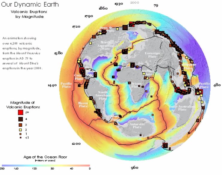
The second video map for the lab worked in the same way except the layout was slightly different. In the screenshots you can see the labels are in different locations representing a part of the whole data rather than a snapshot year. The data builds rather than changing. In this map the number and locations of volcanic eruptions is mapped with the year and magnitude of each.
In these images you can see the building data along with the representation of the years passed going around the globe. Again another inventive idea to represent compiling data in order to analyse trends.
Wednesday, March 29, 2017
Communicating GIS Lab 9
This week for the lab we practiced creating multi-variable maps. In order to do this you have to start with two sets of normalized data that you can represent together in the same area of the map. For our example we have two sets of attribute data associated with the counties in the United States. If you are using a 9-class legend for the choropleth map you should have 3 classes for each of the variables. This will allow you to combine the data into the 9 total classes for the map. The creation of the attribute that you need in the final classification is pretty in-depth into the use of attribute tables in the ArcMAP program, but the basic step is to split each variable into three quantile classes, then add the attributes from each of the variables to crate the final attribute for the classification. In our lab we used 1,2,3 for the obesity variable and A,B,C for the Inactivity variable. So a typical result for a particular county would look like "A3" in the final attribute category.
From here the counties are labeled using a unique values based on this "final attribute" and you have your bivariate choropleth map! The hardest part of making the map is the selection of your colors to represent your classes. You also have to build the 9-class grid from scratch on ArcMAP since there is no feature to do this. In the end the result is worth the effort and it makes for an aesthetically pleasing map.
Wednesday, March 15, 2017
Communicating GIS Lab 8
This week we worked with infographics. The goal was to produce a product using two sets of national data. The data I chose was the percent of population that had attended college and the percentage of unemployment. The data is represented by the county in the two maps of the U.S. and the information is broken into state averages in many of the infographics. The two base maps allow the user to draw their own basic conclusions about areas where there is a lower college educated population and higher unemployment. Then the information about the state averages introduces the top three and bottom three performers for college education and unemployment in the bar graph. On the left side of the product there is a scatter plot with a trend-line showing that in all of the county data there is a sight trend confirming the basic conclusion that can be drawn. Additionally there is summary information provided in the center of the product referencing the total U.S. averages and year prior statistics.
In
finalizing the layout I decided that the design would look cleaner if I
separated each infographic with its own “neat line.” This would cut down on
confusion of legends and data between infographics and help direct the user
where to look for what information. I chose different areas for the
infographics based off where the map data was for the two U.S maps. I used the
spaces that were best fitted for the infographic to help balance the product as
a whole. I chose a dark background color to represent either water or just a
neutral background for all of the information to be overlaid on. I was able to
use normal legend symbology effectively by curving it around the map features.
This helped with the overall balance of the product as well. Finally I added a
title describing the data and year of the analysis.
Wednesday, March 8, 2017
Communicating GIS Lab 7
This week we spent time learning about terrain elevation an how we can visualize it effectively in ArcGIS. We started with elevation data and in this example added land cover polygon data. The elevation data is useful by itself, but it is hard to visualize what is high terrain and what is lower terrain. To give a better picture I executed a hillshade with the standard altitude and elevation to shed a little light on the terrain. With the hillshade you can see the actual ridges and valleys of the area and determine slopes better than the flat gray scale data. Then I took land cover data and adjusted the symbology to show the different types of features in their actual colors (for the most part), some are altered to distinguish between types of vegetation easier on the map.
Finally with both layers displayed correctly I adjusted the transparency of the land cover layer to allow the hillshade layer to be visible underneath it. This creates the illusion that the 3D hillshade is colored with the land cover data. Then by adding the standard map elements and trying to balance the awkwardly shaped area as best as possible, I was able to produce an effective map representing elevation and land cover data in one.
Subscribe to:
Posts (Atom)