Tuesday, April 4, 2017

Communicating GIS Lab 10

This week for the lab we worked with temporal mapping. For our end products we produced a video file that consisted of a map showing the changes in data over a certain time. Rather than using a comparative map side-by-side the video allows the map creator to chronologically display many maps of data one after the next for a certain length of time. This helps the user visualize the changes and see trends that may be hard to distinguish in the side-by-side comparison. In the first video we experimented with changing population on the major U.S. cities up to the year 2000.

For this video the screenshots show how at different times in the video the data displayed is different and the symbology and labels correspond to the time frame being displayed. These features are accomplished through dynamic and static labeling along with corresponding displayed symbology.


Year 1870
    
Year 1970
In the first image you can see the year label 1870 is darkened to represent the current data year. The symbology also reflects the graduated symbol population of the major U.S. cities for the year of 1870. Also at the top right of the map you can see we practiced adding the dynamic text with the "Year: 1870" displayed. In the second image you can see that the data is different based on the symbology for the population and the dynamic labels representing the year 1970 rather than 1870. These images are just two screenshots from the video file. When the video is played it shows the years of data in a chronological order and the populations seem to grow as the years progress. It is a very fancy representation of a large amount of trend data.


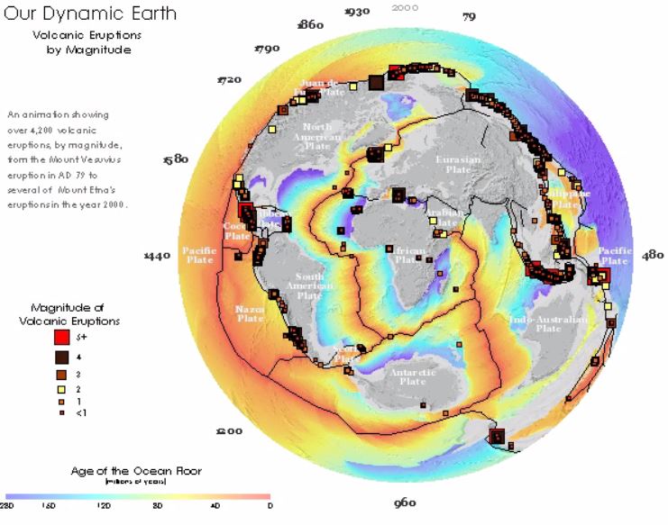
The second video map for the lab worked in the same way except the layout was slightly different. In the screenshots you can see the labels are in different locations representing a part of the whole data rather than a snapshot year. The data builds rather than changing. In this map the number and locations of volcanic eruptions is mapped with the year and magnitude of each.

In these images you can see the building data along with the representation of the years passed going around the globe. Again another inventive idea to represent compiling data in order to analyse trends. 


Wednesday, March 29, 2017

Communicating GIS Lab 9

This week for the lab we practiced creating multi-variable maps. In order to do this you have to start with two sets of normalized data that you can represent together in the same area of the map. For our example we have two sets of attribute data associated with the counties in the United States. If you are using a 9-class legend for the choropleth map you should have 3 classes for each of the variables. This will allow you to combine the data into the 9 total classes for the map. The creation of the attribute that you need in the final classification is pretty in-depth into the use of attribute tables in the ArcMAP program, but the basic step is to split each variable into three quantile classes, then add the attributes from each of the variables to crate the final attribute for the classification. In our lab we used 1,2,3 for the obesity variable and A,B,C for the Inactivity variable. So a typical result for a particular county would look like "A3" in the final attribute category.
 From here the counties are labeled using a unique values based on this "final attribute" and you have your bivariate choropleth map! The hardest part of making the map is the selection of your colors to represent your classes. You also have to build the 9-class grid from scratch on ArcMAP since there is no feature to do this. In the end the result is worth the effort and it makes for an aesthetically pleasing map.

Wednesday, March 15, 2017

Communicating GIS Lab 8

This week we worked with infographics. The goal was to produce a product using two sets of national data. The data I chose was the percent of population that had attended college and the percentage of unemployment. The data is represented by the county in the two maps of the U.S. and the information is broken into state averages in many of the infographics. The two base maps allow the user to draw their own basic conclusions about areas where there is a lower college educated population and higher unemployment. Then the information about the state averages introduces the top three and bottom three performers for college education and unemployment in the bar graph. On the left side of the product there is a scatter plot with a trend-line showing that in all of the county data there is a sight trend confirming the basic conclusion that can be drawn. Additionally there is summary information provided in the center of the product referencing the total U.S. averages and year prior statistics.
In finalizing the layout I decided that the design would look cleaner if I separated each infographic with its own “neat line.” This would cut down on confusion of legends and data between infographics and help direct the user where to look for what information. I chose different areas for the infographics based off where the map data was for the two U.S maps. I used the spaces that were best fitted for the infographic to help balance the product as a whole. I chose a dark background color to represent either water or just a neutral background for all of the information to be overlaid on. I was able to use normal legend symbology effectively by curving it around the map features. This helped with the overall balance of the product as well. Finally I added a title describing the data and year of the analysis. 

Wednesday, March 8, 2017

Communicating GIS Lab 7

This week we spent time learning about terrain elevation an how we can visualize it effectively in ArcGIS. We started with elevation data and in this example added land cover polygon data. The elevation data is useful by itself, but it is hard to visualize what is high terrain and what is lower terrain. To give a better picture I executed a hillshade with the standard altitude and elevation to shed a little light on the terrain. With the hillshade you can see the actual ridges and valleys of the area and determine slopes better than the flat gray scale data. Then I took land cover data and adjusted the symbology to show the different types of features in their actual colors (for the most part), some are altered to distinguish between types of vegetation easier on the map.
Finally with both layers displayed correctly I adjusted the transparency of the land cover layer to allow the hillshade layer to be visible underneath it. This creates the illusion that the 3D hillshade is colored with the land cover data. Then by adding the standard map elements and trying to balance the awkwardly shaped area as best as possible, I was able to produce an effective map representing elevation and land cover data in one.

Wednesday, February 22, 2017

Communicating GIS Lab 6

This week we experimented with Choropleth maps. We learned different classification techniques and what each are useful for. I was able to create a few maps to practice my skills with the symbology and color ramps. One of the big learning points for me was the use of normalized data rather than raw data. The normalized data allows the creator to successfully display the information accurately while raw data would have no real meaning being classified.


The culmination of Lab 6 was our choropleth map of Colorado population change between 2010 and 2014. For my classification I used 6 classes in order to get 0% between two classes. I chose a color ramp of diverging red and green to show an increase in population with green hues and a decrease in population with red hues. The 6 classes were separated using the natural breaks classification. This gave me an accurate representation for all of the data without skewing the classes. I then adjusted the middle class to begin at 0%.

For the legend I ordered the classes to show the increasing percentages at the top and decreasing percentages at the bottom with their respective symbols. I rounded the percentages to two decimal places since the percentages were generally small. For the title and description I used the Population change and the years it occurred.

Wednesday, February 15, 2017

Communicating GIS Lab 5

Proportional symbol mapping can be a useful tool when trying to display numerical data based on certain features. This week we experimented with the symbology and how to effectively communicate data to the user. Proportional symbology allowed us to use different sized symbols to represent specific numerical values for different areas. With the areas being proportional to each other based on the data it made it easy for users to draw conclusions based on the data. 

One particularly interesting feature we worked with was how to display positive and negative numerical data using the proportional symbol mapping. In the map below you can see that the same proportional symbols can be used creatively to display a positive value of the data (Green) and a negative value (Red). 


With the symbols staying the same size proportionally based on the absolute value of the numerical data we had to represent them as neutral in the legend and then explain the coloring system. This was a neat solution to an interesting problem. At first it seemed difficult to display the wide range of data in this map with something other than color ramps, but the proportional symbology made it quite simple in the end.

I think this type of symbology also grabs the users attention better than using a color ramp. With different sized objects representing data on a map it draws the users attention immediately to the fact that one is bigger than the other. Rather than seeing a specific color and wondering what that color represents the user can identify that one area has more of something or is larger in a number of something than another area without referencing the legend. This could be extremely useful in quick reference products where the title explains the data.

Saturday, February 4, 2017

Communicating GIS Lab 4

This week we are working with color progressions and experimenting with linear vs. adjusted color ramps. The linear progression makes the most sense mathematically when it comes to choosing colors in a ranking scale. The darker shades are definitely harder to distinguish from one another. I did not think they would be as close as the lab described, but it definitely shows in the color ramps. For this reason I think the adjusted progression is the most effective. The color ramp clearly separates the darker shades more than the lighter ones. With my adjustment I went with the “1/3” rule the lab described and it seemed to work. I was pleased with the color ramp and would choose the adjusted ramp over the linear one. Then using colorbrew I selected a slightly greener base. The intervals seemed to follow the adjusted progression, but were almost random in a sense. They were generally larger for the darker shades, but had no real pattern.